October 2021
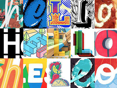
This is the font design work I created for the review of SCAD M.A. graphic design major. This font covers a total of 1,623 CHARACTERS (Basic English letters + basic Cyrillic letters + numbers + punctuation marks + traditional Mongolian script with different kerning).
I am a Mongolian who was born and raised in China, and I hope to design a Mongolian script font with personality. This Song Guang font is my inspiration from my memories and hopes to promote intercultural communication between my hometown and the universe through this font.
You can also get more of my stories through this link

Research
The target audience who is curious about Mongolian culture is influenced by Mongolian culture and has a need for intercultural communication in Mongolian culture in the digital age. They were born after 1940.
The classical or traditional Mongolian script, Computer operating systems have been slow to adopt support for the Mongolian script, and all have incomplete support or other text rendering difficulties. Mongolian culture is very shining in history, but Mongolian culture in the modern civilization system has no sense of participation. The writing system is complex and chaotic, causing intercultural communication between Mongolian culture and other cultures to be full of obstacles. This is an understanding barrier from Mongolian script.


Make a demo
Analyzing the results of previous research and summarizing the characteristics of Chinese characters and Century Font. Finally confirmed a creative direction- a sans serif font of tall ×-height, slightly wider letters, same kerning, and short lifting parts blends two details of Song Guang cinema rough and tall serif and the cut corner on the upper right.
Analyzing the results of previous research and summarizing the characteristics of Chinese characters and Century Font. Finally confirmed a creative direction- a sans serif font of tall ×-height, slightly wider letters, same kerning, and short lifting parts blends two details of Song Guang cinema rough and tall serif and the cut corner on the upper right.


Final work
After researching and analyzing, and reorganizing the problems with the demo, I decided on the final design features. Each letter has a 45-degree tangent angle on the upper right side.
After researching and analyzing, and reorganizing the problems with the demo, I decided on the final design features. Each letter has a 45-degree tangent angle on the upper right side.
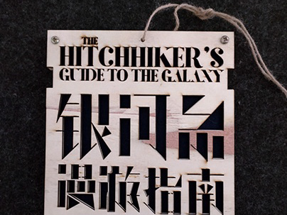
There are 1623 characters in this set, covering all basic English letters, basic Cyrillic letters, numbers, punctuation marks, and traditional Mongolian script with different kerning.
This font has been tested and will work well when used as a headline font, and still needs to continue to be optimized in the future for use in multilingual mixed body typography scenarios.
This font has been tested and will work well when used as a headline font, and still needs to continue to be optimized in the future for use in multilingual mixed body typography scenarios.


Font usage scenarios
The development of traditional Mongolian script digital fonts is exceedingly difficult. However, for the intercultural usage scenario, we have designed distinctive design solutions to meet unique needs. I believe that the digital use of fonts should be designed from the perspective of cultural equality and should be tailored to meet the habits of distinct cultures. Therefore, in my scenario, the Mongolian script information and the English information use completely different typographic order.
The development of traditional Mongolian script digital fonts is exceedingly difficult. However, for the intercultural usage scenario, we have designed distinctive design solutions to meet unique needs. I believe that the digital use of fonts should be designed from the perspective of cultural equality and should be tailored to meet the habits of distinct cultures. Therefore, in my scenario, the Mongolian script information and the English information use completely different typographic order.